
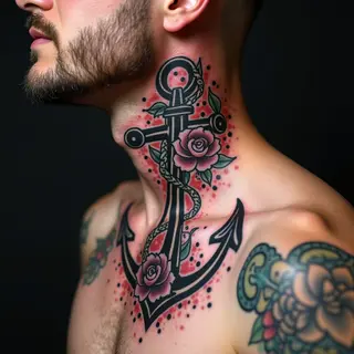

Color Blending in Tattoos: A Practical Guide
Blending colors in a tattoo isn't just about applying ink—it’s the key to depth, realism, and that striking visual impact. It requires understanding color theory, layering techniques, and how skin absorbs pigment.
Essential Color Blending Techniques
Here's a breakdown of the core principles to consider:
1. Understanding Color Theory
A good foundation in color relationships is vital—think complementary colors like red and green, analogous hues such as blues and purples, and the difference between warm and cool tones. This knowledge helps you anticipate how colors will interact on the skin.
2. Gradual Layering: The Foundation
The core of blending is gradual layering. Begin with lighter shades and slowly build up darker tones, using thin lines or dots. Avoid large blocks of color; instead, work in small, controlled sections.
3. Dotwork & Stippling for Texture
Dotwork and stippling create a textured blending effect by using closely spaced dots of varying colors. It’s an excellent way to achieve soft transitions and subtle shading.
4. Feathering for Seamless Blends
Feathered edges soften the boundaries between color areas, creating a seamless blend. This requires precise control over needle depth and angle—a delicate touch.
5. Watercolor Techniques: A Specific Style
When aiming for a watercolor effect, artists often use diluted inks and wet-on-wet techniques to allow colors to naturally bleed and merge—it’s all about letting the pigments flow.
6. Skin Tone Considerations
Skin tone significantly impacts how colors appear. Colors will look different on fair versus dark skin, so adjust your palette accordingly—it's a crucial observation.
7. The Importance of Artist Skill
Blending is a skill that demands practice and a keen eye for detail. Choosing an experienced artist who specializes in color blending is essential to get the result you want.